Wednesday 30 May 2012

Topshop War Paint

Just a quick post today to show you a fun, summery colour. Topshop War Paint is a bright red/coral shade that is almost, but not quite, neon. I wore this a few times last summer before I started blogging - it looks especially great as a pedicure colour. The formula is good; two coats for full coverage, although I did an unnecessary third coat.

As you probably know, the Queen's Diamond Jubilee is only a few days away so on Friday I'll be doing a themed Foodie Friday post, and on Sunday, Monday and Tuesday I'll be showing you themed manicures! I'm really looking forward to it, and I hope you enjoy them! :)

Sunday 27 May 2012

Grey & Turquoise Leopard Print Mani

I was awfully slow to jump on the leopard print manicure bandwagon, but now that I have - I never want to get off it! They're so easy and really eye-catching. I got a ton of compliments when I wore the one I'm showing you today.

I started with two coats of Rimmel London Grey Matter. It's a medium grey - a true grey, with no hint of beige or anything like that. It's really clean and fresh-looking, and it looks great on its own, too. I then randomly blobbed on China Glaze Turned Up Turquoise, a neon turquoise with a gorgeous shimmer (FYI: it's more green-toned than it appears in my photos). It's soooo pretty! Finally, I used my trusty black Models Own Wah Nail Art Pen to draw round the blobs, and covered with a top coat. I really like how this turned out, particularly the contrast between the grey and the neon.

To see my previous leopard/cheetah print manicures, you can find them here and here.

Have you jumped on the leopard manicure bandwagon? If not, why not?!

Friday 25 May 2012

The Battle of the Cornflower Blues

I try to only buy polishes that are dissimilar to each other, but I noticed the other day that I seem to have accrued several cornflower blues that all look alike. Oops! I thought it might be interesting to see how they stack up against each other. Without further ado, the contenders are:

From left to right:
Nails Inc Chalk Farm
Rimmel London Aqua Cool
China Glaze Electric Beat
Essie Lapis of Luxury

I used three coats of each polish. Only Lapis of Luxury actually needed the third. In terms of application, I'd say Chalk Farm and Aqua Cool were the best and Electric Beat was the worst - but to be honest they were all pretty great so I'm just being picky here!

As for colour, it's immediately obvious that Chalk Lane is darker and perhaps more of a periwinkle than cornflower blue because it has a touch of purple in it. Although Aqua Cool and Lapis of Luxury look very slightly different in my photos, in real life they're identical - Electric Beat is a touch lighter than these two.

I hope this helps anyone who's on the hunt for a pretty cornflower blue. Do any of you have several very similar colours in your stash?

Thursday 24 May 2012

The Many Faces of Claude

Now that the sun has come out, I decided to give my hamster Claude his first taste of the great outdoors (aka my back garden). I don't think he knew what to make of the grass at first, but he soon got over it and scampered about happily. I actually managed to take a few decent photos of him, which was a pleasant surprise because he doesn't usually stay still long enough for me to do this!


Cautious Claude


Intent Claude


Curious Claude


Gormless Claude

Wednesday 23 May 2012

Nicole by OPI Kim-pletely in Love

I would just like to state for the record that I am not a Kardashian fan. I have never seen the TV show and I don't read gossip magazines. But I couldn't resist buying a polish from their collection with Nicole by OPI because the colour looked so pretty and girly. Kim-pletely in Love is a pale pink polish with blueish microglitter. It's very sheer - I used four coats for the photos below and you can still see my nail line - but the application itself was good and it dried very quickly.

When I showed my mum these photos, her only comment was that my fingers looked really wrinkly! Thanks, Mum.

Monday 21 May 2012

Topshop Louder with Models Own Ibiza Mix

I went up to London last Tuesday for a bit of culture and retail therapy. In the morning I visited the 
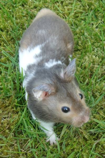
Turner Inspired: In the Light of Claude exhibition at the National Gallery, because the historic house I work at loaned one of their Turners for it. It was really interesting. I know quite a bit about the artist Turner, but very little about Claude (although given that he 
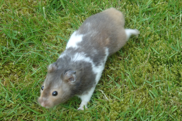
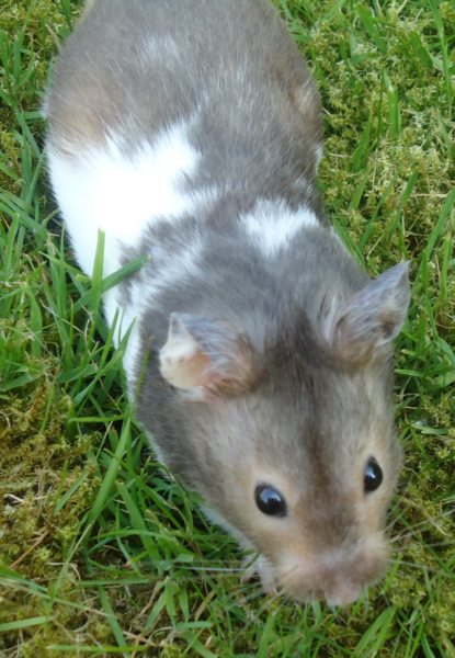
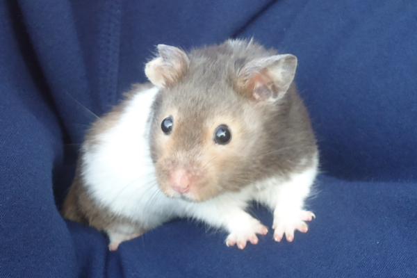
shares a name with my hamster, you think I'd know more!). After the exhibition I endured the Tube and went to Westfield to see the new(ish) Models Own stand.

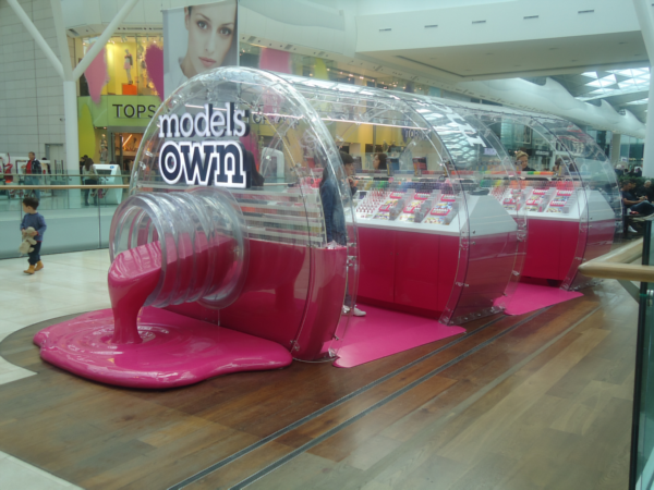
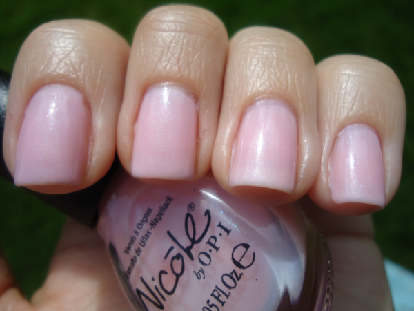
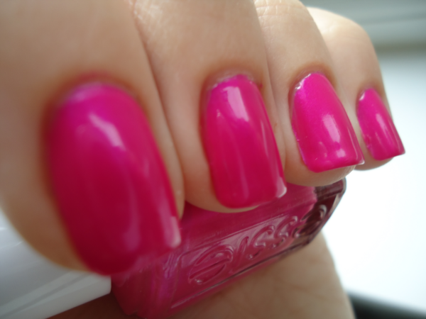
Isn't it pretty?! The staff were really friendly (one of them complimented my nails, which made me happy!) and they had a great range of colours. And they don't have tills, they have iPads that act as tills! SO COOL. I actually ended up only getting one Models Own polish, but I got six others by various brands. Hmmm. Only seven. That's quite restrained for me.

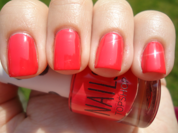
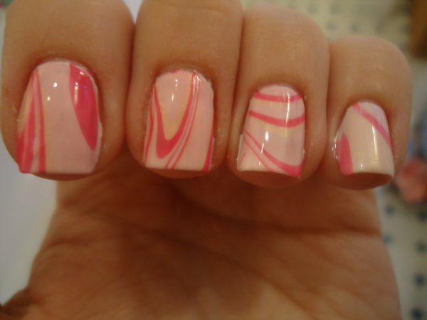
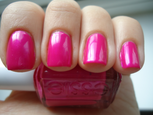
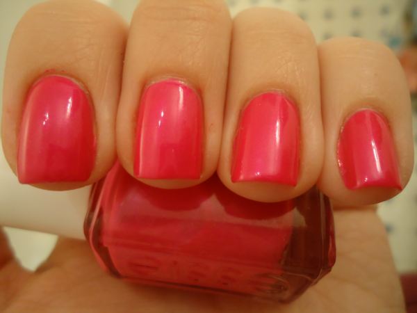
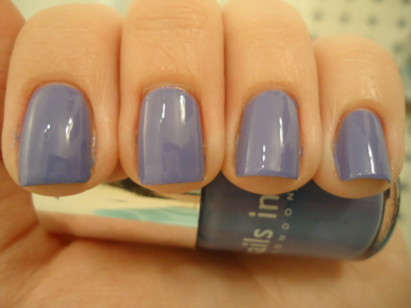
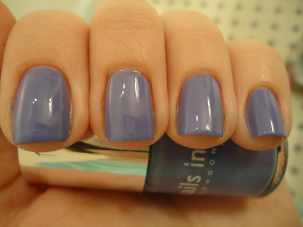
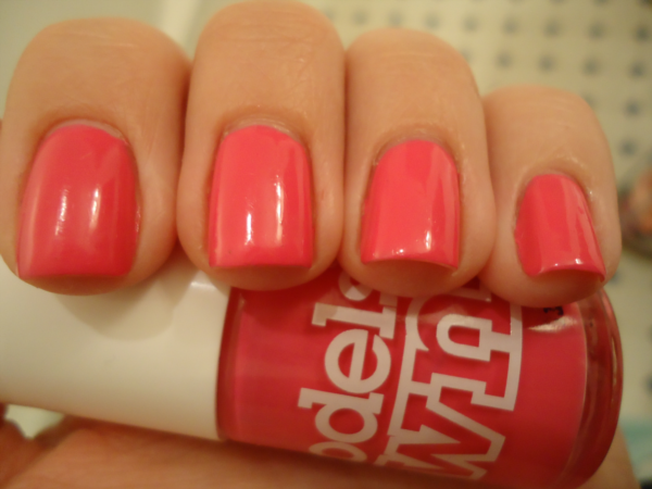
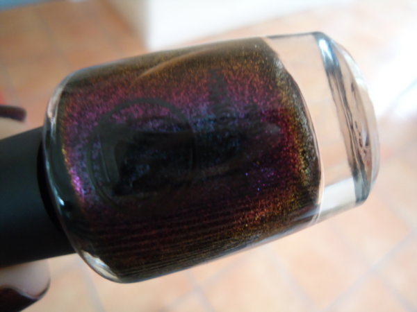
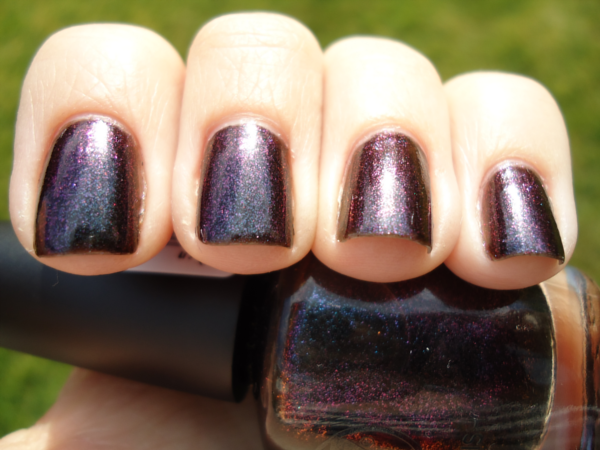
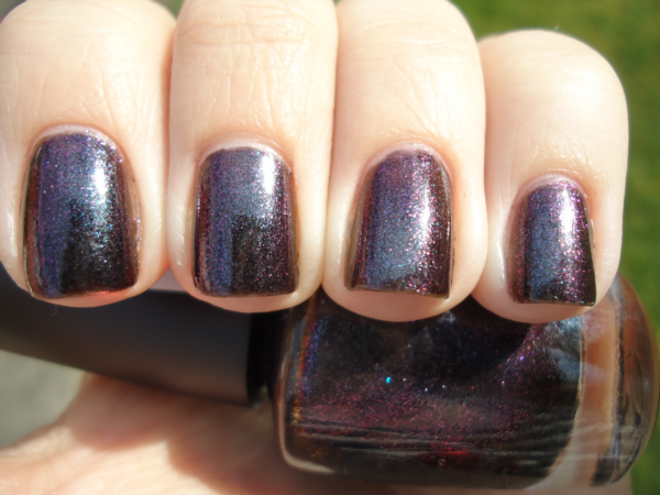
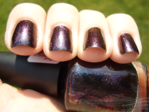
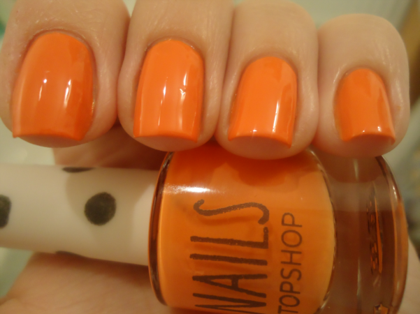
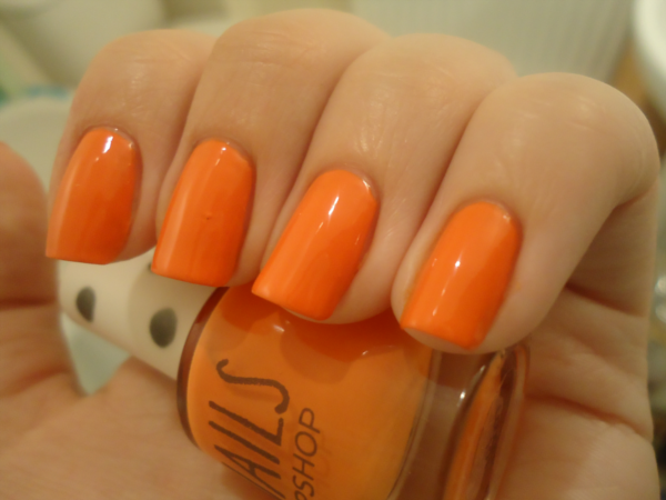
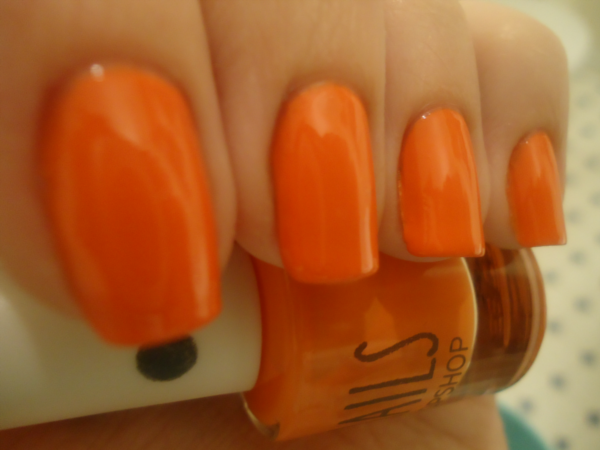
Today I'm showing you the Models Own polish layered over another one I got in London, Topshop Louder. Louder is a bright tangerine creme. It has a great formula, covering in two easy coats.

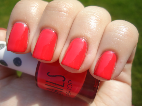
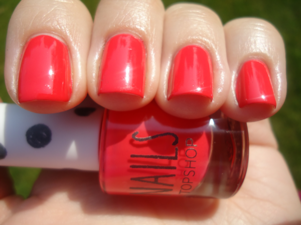
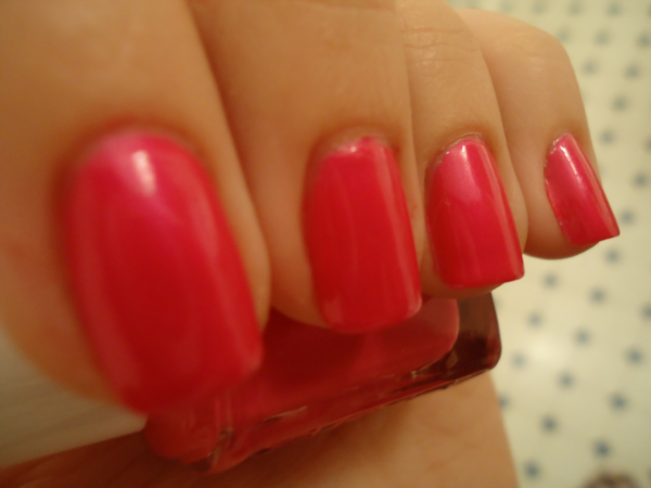
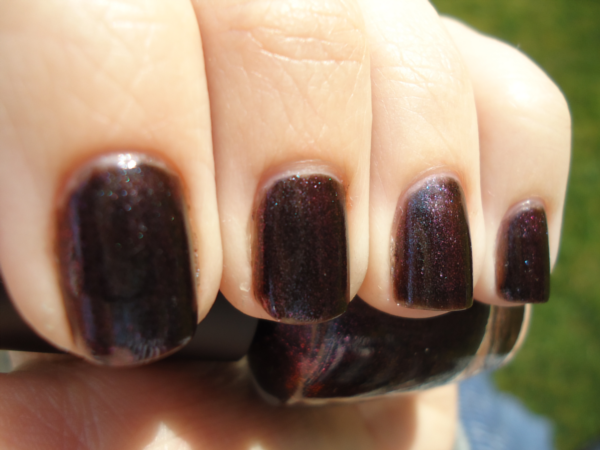
In all honestly, I don't know what possessed me to buy this. It's a nice colour, but orange/tangerine does not go with my colouring at all - it needs someone with darker skin than mine to really pull it off. To see if I could save it, I layered my new Models Own polish, Ibiza Mix, over it. Ibiza Mix is multicoloured large and small hexagonal glitter in a clear base:

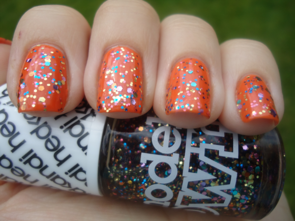
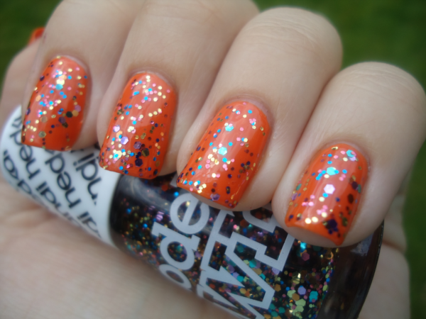
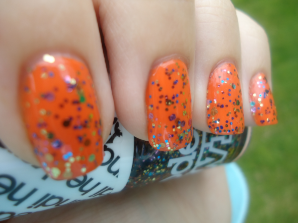
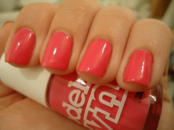
I went to the Models Own stand with the express intention of getting this polish, but now I have it my feelings on it are mixed. On the one hand, it looks pretty cool and it did make this manicure slightly more bearable for me. On the other hand...the formula was rubbish. The glitter was sparse - this is two coats, so full coverage wasn't an option - and the clear base was very runny. It kind of felt like they'd just dumped a load of random glitter in a bottle of clear nail polish. Maybe I got a dud bottle...?

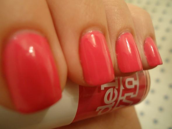
What do you think of this combination? Are you hopping on this year's tangerine bandwagon?

Saturday 19 May 2012

Models Own Water Marble

Last month I tried my hand at a water marble for the first time, and while it kind of worked I wasn't 100% happy with it. I decided to try again and I'm pleased to report my second go was somewhat more successful. Take a look:

Products:
Models Own Pastel Pink
Models Own Sophie's Pink
Models Own Golden Peach

That faint gold shimmer you see is Golden Peach, which turned out to be a lot sheerer than I expected! Oh well, at least I know for future reference. I'm actually pretty chuffed with how this turned out, although I think I need to work on my patterns - I was aiming for a chevron design! XD

Thursday 17 May 2012

Illamasqua Baptiste Covered in Diamonds

I've said it many times before, and I'll say it again: I love purple nail polishes. I bought Illamasqua Baptiste recently and it's quickly catapaulted itself onto the list of my favourite purple polishes - maybe even the list of my favourite polishes in general. It is a dark purple with a shimmer that gives it a ridiculous amount of depth - it's one of those cool polishes that looks like it's glowing from within. Baptiste is almost a one-coater, but I used two for the photos below.

SO PRETTY.

After a couple of days I decided to layer something over the top, and I reached for Color Club Covered in Diamonds. Here's the result:

Tuesday 15 May 2012

Essie Tour de Finance

Have any of my fellow Brits reading this heard of Restoration Man? It's a show on Channel 4 where people restore old houses. The reason I mention it is because they filmed a segment for it at the historic house I work at last week! I have a huge crush on the presenter, George Clarke (he just comes across like such a nice guy!), and when he smiled politely at me I went all gooey inside. Yes, I am that pathetic...

So anyway, here's what I was wearing that day: Essie Tour de Finance from this year's spring collection. It's a medium fuchsia with a blue shimmer. There are lots of similar polishes out there, but I like it regardless. It's bright and fun. The formula was good - this was three coats, but it didn't really need the third, I just did it out of habit. Like Models Own Sophie's Pink, it looks a lot more coral-coloured in artifical light than it does in real life.

Sunday 13 May 2012

Deborah Lippmann Wicked Game

Deborah Lippmann polishes aren't widely available in the UK and they're pretty pricey. Until recently, the only polish I had from this brand was Razzle Dazzle, which came in a GlossyBox last year. However, I saw some nice swatches of Wicked Game online recently and it looked like my sort of colour, so I took the plunge and bought it. At £14, it now has the distinction of being the most I have ever paid for one bottle of nail polish!

Wicked Game is a purple/green/grey duochrome that is often described as looking like an oil slick. Application wasn't great. It dries to a chrome finish so it shows every imperfection. It also bubbled like crazy. Sad. Anyway, photo time:

Despite the application issues, I like it. It has a very strong duochrome effect, and I love the colours it shifts to (even the green!). There are various similar, if not identical, polishes out there though - so if you're not willing to splurge on this brand, I believe Wet n Wild Anatomy, Essence Where's the Party?, OPI Not Like the Movies and Nubar Purple Beach are all quite close.

Wednesday 9 May 2012

Nails Inc Chalk Farm

I thought I'd share one of my favourite Nails Inc polishes with you today: Chalk Farm. It's a gorgeous light cornflower blue that is close to being a one-coater, although I used two coats for the photos below. Application is a breeze and it dries super shiny. I don't have a lot else to say about it, except that I loooove it!

Tuesday 8 May 2012

Models Own Sophie's Pink

I have a confession to make: I only bought Models Own Sophie's Pink because we share the same name. That is literally the only reason. I know Zoya has a polish called Sophie, but that brand isn't widely available in the UK - and it's a reddish terracotta colour that's even less me than Sophie's Pink, which is a hot pink creme. The formula of Sophie's Pink was good; I used three coats in the photos below, but this was more out of habit than because it really needed the third. So without further ado, here is My Pink:

I had to use artificial light due to a distinct lack of sun, so the photos aren't very colour accurate, I'm afraid. It's not remotely coral like you see here; it's definitely hot pink. I actually think I like the colour more in my photos than in real life!

Have any of you ever bought a nail polish because of its name? Do you have a Zoya polish named after you?

Sunday 6 May 2012

W7 Metallic Jupiter

Sometimes you come across a nail polish that just looks so much cooler in the bottle than it does on the nail. I hate to say it, but I think W7 Metallic Jupiter is one of those polishes. I picked it up in a set of three W7 colours from TK Maxx for some ridiculously cheap price, lured in by the rainbow in the bottle:

On the nail, the red/gold disappears and you're left with what is essentially a blackened purple/blue duochrome. It's really pretty, and it makes a nice change from all the pastels and neons I've been wearing recently. But I hate that it held so much more promise in the bottle!

If you are less picky than me and love a good duochrome, W7 Metallic Jupiter is priced at £1.95 to buy online - what a bargain!